스토리북에서 컬러팔레트를 자체제작하려했다.
내 프로젝트 배경색을 어둡게 하려했는데, 기본적으로 밝은 테마가 적용돼 객관적인 판단이 어려웠다.
import { Meta, ColorPalette, ColorItem } from "@storybook/blocks";

<Meta title="Colors" />

<ColorPalette style={{background: "black"}}>
  {...}
</ColorPalette>
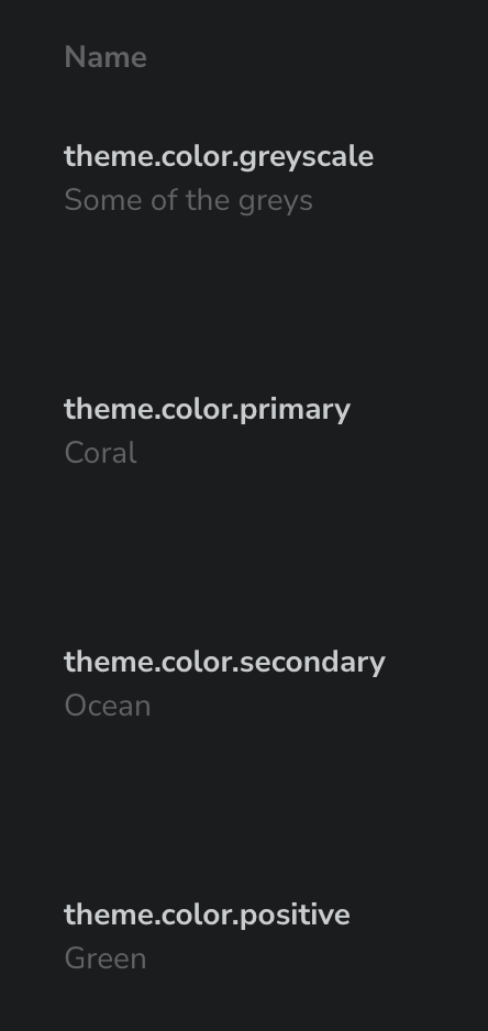
이런 식으로 적용한다면, 문제가 있다.
왜냐하면 child로 올 ColorItem의 내용물이 배경색에 의해 보이지 않는다는 것이다.
ColorItem에 커스텀 스타일을 적용하려 했지만, 개발자도구로 까봤더니 상당히 복잡했고 예상대로 style props로 color을 지정해준다해도 바뀌지 않았다.
아마 storybook은 css in js나 css module을 사용하는 것 같아 className을 이용해 직접 스타일 지정하기도 미래를 생각하면 두려워졌다.
다행히 스토리북 자체에 다크테마를 적용할 수 있다. 일종의 땜빵이다.
//manager.ts
import { addons } from "@storybook/manager-api";
import { themes } from "@storybook/theming";

addons.setConfig({
  theme: themes.dark,
});
//preview.ts
import type { Preview } from "@storybook/react";
import { themes } from "@storybook/theming";
const preview: Preview = {
parameters: {
controls: {
matchers: {
color: /(background|color)$/i,
date: /Date$/i,
},
},
docs: {
theme: themes.dark,
},
},
};
export default preview;
이렇게 하면 얼추 땜빵은 된다.
하지만 문제가 있다.
몇몇 글자는 흰색이 됐지만... 아직도 어둡다...
따라서 자체 컴포넌트를 쓸까 고민중이다.
자체 테마를 잘 설정하고 그걸 적용하면 되려나?
import { create } from '@storybook/theming/create';

export default create({
  base: 'light',
  // Typography
  fontBase: '"Open Sans", sans-serif',
  fontCode: 'monospace',

  brandTitle: 'My custom Storybook',
  brandUrl: 'https://example.com',
  brandImage: 'https://storybook.js.org/images/placeholders/350x150.png',
  brandTarget: '_self',

  //
  colorPrimary: '#3A10E5',
  colorSecondary: '#585C6D',

  // UI
  appBg: '#ffffff',
  appContentBg: '#ffffff',
  appPreviewBg: '#ffffff',
  appBorderColor: '#585C6D',
  appBorderRadius: 4,

  // Text colors
  textColor: '#10162F',
  textInverseColor: '#ffffff',

  // Toolbar default and active colors
  barTextColor: '#9E9E9E',
  barSelectedColor: '#585C6D',
  barHoverColor: '#585C6D',
  barBg: '#ffffff',

  // Form colors
  inputBg: '#ffffff',
  inputBorder: '#10162F',
  inputTextColor: '#10162F',
  inputBorderRadius: 2,
});
이런 방안이 있을 것 같긴하다.
근데 각 프로퍼티가 뭘 의미하는지 알아내는 것도 고역일 것 같군
'개발' 카테고리의 다른 글
| Next.js, Vanilla extract 프로젝트에서 storybook 설정하기 (0) | 2024.03.30 |
|---|---|
| 왜 HTMLProps로 button element의 모든 props를 선언하면 size에서 충돌이 일어날까? + 해결방법 (0) | 2024.03.27 |
| next js client component 이해하기 (0) | 2024.03.23 |
| 노마드 코더 nextjs 무료강의 회고 (0) | 2024.03.22 |
| vanilla extract 시작하기 (0) | 2024.03.21 |